Vermont Web Design & Web Hosting Today!
Everything YOUR business needs to compete effectively with expert digital marketing for the web!
Get a customized business website today!
Experienced Vermont web design & web hosting. Get started today!
Alpine Web Media – Vermont Web Design & Web Hosting
Quality, web design and Internet marketing solutions. We help businesses work with web marketing. We provide services to corporations to handle many of their important tasks such as graphic design, e-mail marketing and social media posts.
We are well known for our reliable services and rapid response time. Contact us by email or phone and we'll respond the same day within just a few hours or less. Nothing is more important to us than your business and a timely response.
Call 802-355-8775 to get started today!

VT Web Design & Branding
When your business relies upon branding then it is vitally important to establish your web presence accordingly.

Search Engine Optimization (SEO)
Search engine optimization is not an exact science where there are guaranteed ways to achieve success but there are guidelines that should be followed to increase the chances of success.

Vermont Web Hosting
We've been hosting websites for over 25 years. Like a foundation under a home, web hosting should be sturdy and reliable.
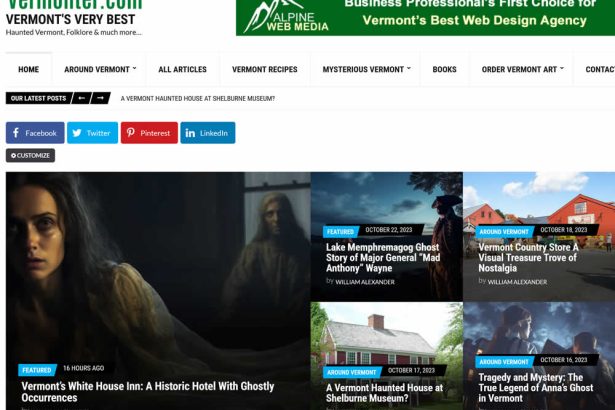
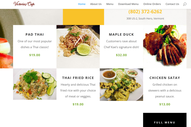
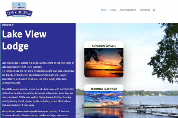
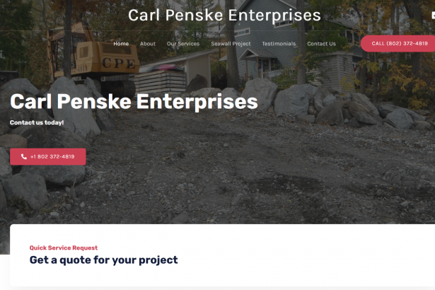
Our Vermont Web Design & VT Web Hosting Portfolio
A sample of our web design and development projects, based in Vermont. We have provided over 30 years of the best, Vermont premium web design and digital marketing services to companies from Burlington to Brattleboro, VT and as far away as Bangkok, Thailand.
We're real Vermonters, born in Vermont
We build websites that businesses need to succeed

Solid Vermont Web Design You Can Trust
Affordable, reliable, WordPress based, expert VT web designers. Social media and web marketing news & tips!